PA28/32 Wing Spar AD - Show me the data!

Eric Pauley

Pre-takeoff checklist
Joined
Apr 1, 2021
Messages
260
Location
Madison, WI
Display Name

Display name:
Eric Pauley
Note: I am updating this post incorporating feedback from below.

In 2021, the FAA released AD 2020-26-16, requiring inspection of most PA28/32 wing spars. This AD also required reporting results of the inspections to the FAA and Piper. This data has not been made publicly available, until now.

In October, 2022, I submitted a Freedom of Information Act (FOIA) request to the FAA for a complete copy of all inspection results reported to the FAA. I received data back from this request in March of 2024. The raw data, including my analysis, is publicly available at https://github.com/ericpauley/piper_wingspar

Given this data, I had two key research questions:

1. Are ECI failures consistent with fatigue (which is additive and would be consistent with life-limiting components), or with random occurences such as hard landings, which suggest recurrent inspections but are not consistent with life limits.
2. Are Factored Service Hours/Commercial Service Hours an accurate depiction of risk? What is the relative hazard of commercial and non-commercial service hours?

General Trends

Up until this point, the FAA has only released some general data in SAIB 2022-20; this was mostly anecdotal data on high-time wing spars that failed ECI. However, this did not include information on the number of aircraft inspected (there is a bias in the data as low-time planes were not required to perform the AD). Let's look at a histogram of failed spars by time in service:

Screenshot 2024-07-06 at 8.09.39 PM.png
This may look like more failures in high-time spars, but let's look at the spars that didn't fail too:


Screenshot 2024-07-06 at 8.11.36 PM.png

Here, outcome "True" is passed and "False" is failed. Basically, the failures roughly follow the spars that were tested. Let's instead look at the failure rate by different aged spars (based on Factored Service Hours):

Screenshot 2024-07-06 at 8.15.49 PM.png
Here, each bar represents a bucket of ages (first bucket is 0-2500 FSH and so on). The lines represent 95% confidence intervals for the actual failure rate. In effect, differences in failure rates past 5000 hours are not statistically significant. Of course, we would expect spars with more time to be more likely to fail, simply because they have had more time to be damaged. The real question is whether what we are seeing is fatigue (i.e., stress that accumulates and will eventually cause failure) or accumulated possibilities for random damage, such as from a hard landing.

Determining Failure Distribution

If spar ECI failure is a result of occurences such as hard landings, we would expect these failures to be memoryless: effectively, every flight hour is a roll of the dice, and a spar accumulates more chances for damage over time. This would mean several things:
* A spar can experience ECI failure at any time, even with low hours
* A spar is just as likely to go from good to bad in hours 0-5000 as in hours 10000-15000

In statistics, this is known as a Poisson process, and is characterized by the Mean Time Between Failures (MTBF). Let's proceed under the assumption that spar failure is a Poisson process. We can use Maximum Likelihood Estimation to determine a candidate MTBF that makes the observed outcome most likely. I did this analysis computationally and found the MTBF of piper wing spars to be roughly 375,000 Factored Service Hours. This gets us part way there, but still follows the FAA's assumption that one commercial hour is equivalent to 17 non-commercial hours.

Next, we'll try to determine the hazard ratio between commercial and non-commercial hours. We'll do the same MLE as above, but this time determine the hazard ratio as well.

Result: The MTBF of piper wing spars is 510,000 hours, with commercial hours counting for 1.17 non-commercial hours.

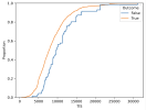
To visualize this, let's look at the cumulative distribution of overall spars, failed spars, along with the spar failures we'd expect to see under this model:

Screenshot 2024-07-07 at 1.49.50 PM.png

The failure distribution (in orange) almost exactly matches the expected failure distribution (in green) under purely random failure rates. We can use a goodness-of-fit test to determine whether this matches the ECI failures reported to the FAA. This test yields a p-value of 0.88, which strongly implies (though does not prove!) that ECI failures are consistent with this memoryless process and not with fatigue.

TL;DR: My conclusions from analysis of 8500 Piper wing spars suggest:
1. Failures are memoryless (i.e., not necessarily caused by fatigue) with an average MTBF of 510,000 non-commercial hours, and with commercial hours counting for 1.17 non-commercial hours.
2. There is insufficient data from the AD to say anything about the increased failure rate of ultra-high-time spars
3. Spars can fail ECI at any time, even with low TIS, FSH, or CSH. This is inconsistent with the initial inspection delay of 4500-5000h in SB1372.
4. The evidence from the spar AD inspection reports does not support a life limit on wing spars (note: other sources like accelerated lifecycle testing could indicate otherwise. I'm a computer scientist and statistician, not a structural engineer!)
5. The results do suggest recurrent inspections, but not the 4500-5000h initial wait that Piper currently recommends in SB1372. The period between these inspections depends on a variety of factors, including the MTBF that I've determined above.
 

Attachments

  • Screenshot 2024-07-06 at 8.12.33 PM.png
    Screenshot 2024-07-06 at 8.12.33 PM.png
    139.4 KB · Views: 173
  • Screenshot 2024-07-06 at 8.14.12 PM.png
    Screenshot 2024-07-06 at 8.14.12 PM.png
    138.9 KB · Views: 9
  • Screenshot 2024-07-06 at 8.16.26 PM.png
    Screenshot 2024-07-06 at 8.16.26 PM.png
    140 KB · Views: 163
  • Screenshot 2024-07-06 at 8.36.23 PM.png
    Screenshot 2024-07-06 at 8.36.23 PM.png
    121.1 KB · Views: 168
Last edited:
I am an aerospace engineer by education, and I work in a technical environment. I deal with math and graphs all the time.

However, I've never studied statistics so besides a general understanding of means, medians, standard deviations, and margins of error, I know little about statistical analysis techniques. Several of your graphs (the ones with "Proportion" along the Y-axis) are not intuitive to me, and I am not sure I understand the significance of what I'm seeing, nor is it obvious to me that the conclusions you draw are true.

For example: After the first two plots, you state: "Basically, the failures roughly follow the spars that were tested." This is not obviously apparent to me. The "True" plot looks something like a bell curve. If you squint your eyes, maybe the "False" plot does too, but when you overlay the two, the bells do not seem to align well. Really, only the 6000 - 9000 bars seem to align, which might be coincidence as much as correlation.

In the final plot, you state that the blue line almost exactly matches the red line. But since I don't understand what that plot is trying to tell me, I don't know if I agree with that or not. I can see that the the blue line has approximately the same shape, but it is consistently offset to the left. At some X values, the blue line is rather higher than the red line. However, since I don't understand what those values mean, I have no idea how much (if any) significance there is in those differences.

In short...your conclusion may be absolutely right, but for all I know you could also be way out in left field. Your argument is not clear and persuasive to a layman with a math and science (but not statistics) background. I have little ability to independently assess the data you are presenting or follow along with your argument.
 
Last edited:
Thanks for the feedback, Jim. This data is all hot-off-the-presses so I'm definitely looking for thoughts on how best to present the results.

The line plots are cumulative distribution plots: https://analyse-it.com/docs/user-guide/distribution/continuous/cdf-plot

You can think of them as integrals of a histogram. These plots could be displayed as histograms but there is so little data here that histograms often show more noise than signal.

Your observation that the histograms look roughly normal is spot on. It's not super important that they are actually normal (after all they're just the TIS/FSH of the PA28/32 population). What matters is that the distribution of failed and successful spars is quite similar. The failed spars do skew higher in total time, but the result is that this skew is fully explained by random failure.
 
How about this. Here's a KDE plot (basically a histogram but continuous) of the same data. You can see the failed spars do skew higher time, but the blue and red skew by the same amount.
Screenshot 2024-07-06 at 9.25.58 PM.png
 
Again, not knowing statistics, I could be way off base, but perhaps part of the problem is that the "signal" is so weak. True results outstrip False results by an order of magnitude, making individual False results strongly influential compared to individual True results.

But the "problem" is that even though "total False" is small in comparison to the size of the tested fleet "total True", there have been dozens of spar failure events so maybe it's hard to just ignore/accept them without trying to understand why they're happening.

It is unfortunate that we don't have data from other aircraft designs to try to determine if PA28 spar issues are an outlier with respect to planes of similar design and usage.
 
How about this. Here's a KDE plot (basically a histogram but continuous) of the same data. You can see the failed spars do skew higher time, but the blue and red skew by the same amount.
View attachment 131082
That's easier to grasp in sense that, "Yup, those curves look alike." But I still don't have a good feel for what the curves are actually plotting. (I have no idea what "Density = 0.00008" means.)
 
I'm also trying to understand your fundamental argument. It seems like you are taking it as a given that there is some acceptable number of spar failures. How is that different from saying we should just accept that some number of old bridges or buildings or dams should be expected to just collapse because they're simply old, so why bother inspecting them?
 
I'm also trying to understand your fundamental argument. It seems like you are taking it as a given that there is some acceptable number of spar failures. How is that different from saying we should just accept that some number of old bridges or buildings or dams should be expected to just collapse because they're simply old, so why bother inspecting them?
My claim is somewhat more nuanced than this. If failure is a random process, rather than fatgique, then a life limit is not the correct way to prevent failures since failures can also occur at low times. Note: throughout here I'm considering "failure" to be the point at which a spar is damaged to the point it would fail ECI. This is of course imperfect since (a) spars could theoretically separate in-flight without reaching a point where they'd fail ECI, and (b) we can't actually measure this moment in time, we can only know if a spar has already failed at some point in time when we ECI it.

The results do suggest recurrent inspections. To know how often those inspections need to be done you'd need to know (a) how long you have between first ECI indications and in-flight failure or perhaps what percentage of ECI failures lead to flight failures, (b) acceptable fatality rate (DOT tends to use the value of a statistical life), and (c) the MTBF (which I show empirically to be 375,000h).
 
I also can’t follow your logic in the graphs but I do want to note that you are drawing conclusions off a single data set and may not be taking into account everything that went into the life limit of the spar. Inspections such as ECI only have a certain probability of detection. They do not always spot a failure every time especially under uncontrolled conditions. The FAA likely took the POD of the ECI inspection as well as a number of other factors outside your data set when determining the life limit. The purpose of a life limit is to ensure the part is replaced before failure not after it and is usually set well under the life limit of where the normal failure is expected to occur. Inspections such as ECI or FPI are used to find failures that may be out on the early fringes of the bell curve. Remember, the FAA wants no accidents to occur, not just a normal number of accidents that fall under a distribution curve. Finally, the pilot flying doesn’t care how far outside that curve he is if that spar fails in flight.
 
I also can’t follow your logic in the graphs but I do want to note that you are drawing conclusions off a single data set and may not be taking into account everything that went into the life limit of the spar. Inspections such as ECI only have a certain probability of detection. They do not always spot a failure every time especially under uncontrolled conditions. The FAA likely took the POD of the ECI inspection as well as a number of other factors outside your data set when determining the life limit. The purpose of a life limit is to ensure the part is replaced before failure not after it and is usually set well under the life limit of where the normal failure is expected to occur. Inspections such as ECI or FPI are used to find failures that may be out on the early fringes of the bell curve. Remember, the FAA wants no accidents to occur, not just a normal number of accidents that fall under a distribution curve. Finally, the pilot flying doesn’t care how far outside that curve he is if that spar fails in flight.
I completely agree (see my note in Conclusion 4), with the exception that generally the goal should not be “no accidents”, but rather a number where costs are balanced with VSL. If the goal were no accidents at all costs the solution would be to scrap every PA28 today!

Piper no doubt has good engineers, but unfortunately their reasoning is not public. My analysis aims to highlight that Piper’s SB is not consistent with inspection results as we can analyze them. In some ways the data suggest that the SB should be even more conservative (I.e., by not having an initial period before recurring inspections begin).
 
Does your data also show difference between models and wing types?
 
Last edited:
Having dimly recalled my university days and the rather thick statistics tome jumping up off the desk and beating me about the head, I bow to your work.

:biggrin:
 
I am pretty sure that we will see an updated version of AD 2020-26-16 in the near future. Based on numerous log book reviews I am under the impression that a lot of owners and A&Ps do not have a full understanding when the eddy current inspection is necessary. Piper SB 1372 will be some sort of a template.

The mere existence of the new wing spar reinforcement kit, stipulation of two main groups within the PA28/32 line and the exclusion from group 2 models plus all Arrow in group 1 from the life extension program suggest that Piper knows way more than we do.

I cannot imagine that Piper drafts 20 pages of a Service Bulletin with fancy new formulas and very specific tables without being in touch with the FAA.
 
God bless Statisticians. I’m forever grateful that the NIH grant that funded my doctoral research provided enough monies to hire a statistician to analyze my results. TLDR- I ain’t that smart :).
 
If I didn’t miss it, did you have an opportunity to look at the various parameters available and see if there were better predictors than factored service hours?

It seems likely to me that there was probably some work stream to take the failures they were seeing and develop some service or inspection procedure. In doing so, some predictor was developed because going off flight time alone would universally be derided. But they’d have had zero evidence the fabricated signal they created was In fact going to predict issues in the full population of aircraft in service.

So the factored service hours doesn’t seem to correlate strongly to failing the inspection. Is there any data to jam back into a model that improves that?
 
Last edited:
Gosh, I feel like I’m piling on. I’m also an aero engineer. I had, and still after the explanation, have a hard time following the flow.

Open question. Short of time in service, what other data is available to use as a predictive indicator? Every annual tracks time.
 
It’s important To note that failure to find correlation isn’t a failure of the analyst, and it doesn’t mean the work is unimportant.

I was recently in some meeting pointing out that the action being proposed would not support the outcomes that were desired. The fact I didn’t have some alternate proposed course of action was used as a prybar to somehow try To discredit the point that the initial action wouldn’t have done what they wanted, either.

Sometimes the best you can do is be the bearer of the undesired news that two things aren’t related.
 
Think you also need to look at actual failures of the spar (all two of them) vs failures of the test. There were a lot of bad tests early on. An example were several that passed after the bolt hole was cleaned. The other would be MIF from improper bolt removal. There's a lot of noise in the numbers to gain much from a purely statistical analysis.
As the OP said, FAA was supposed to gather a lot of data to provide better direction on the issue. None of that has been forthcoming and the fact you needed a FOIA request to get the data is troubling.
 
In the graph showing random vs. observed failure, the blue line (observed failure) is above & left of the red line (expected random failure). And the graph shows a bulge from 10,000 to 15,000 hours where the difference is greatest. It seems to me that this suggests a trend where airframes having 10k to 15k FSH are more likely to fail.

One could argue that if this bulge were material (caused by fatigue), it should continue to the right. But perhaps not, because beyond 15k hours, there are so few airplanes that the statistics become unreliable.
 
Another question about the graph showing random vs. observed failure: true (orange) vs false (blue) should sum to the entire population. For example if 80% are true then 20% must be false. Yet the curves don't add up this way. Blue, orange, and their sum, all increase with hours. So that means I don't understand what you are graphing.
 
Another question about the graph showing random vs. observed failure: true (orange) vs false (blue) should sum to the entire population. For example if 80% are true then 20% must be false. Yet the curves don't add up this way. Blue, orange, and their sum, all increase with hours. So that means I don't understand what you are graphing.
These plots are CDFs. Commonly used in statistics, but unfortunately difficult to interpret if you're not used to looking at them. You can normalize these so all the series add to one, but then the failure line would be basically impossible to see (hence why they don't). You can think of these as, for a given X value (hours) that proportion of success/failure samples had at most that many hours.

Can't take your argument seriously if you can't make graphs that makes sense.
Such is the bane of data analysis. Stats are hard and often it's nigh-impossible to make data more readable without eroding the trends being analyzed.
 
Random in a specially chosen set that's designed to select the most fatigued wing spars in the fleet. I guess it wouldn't be a surprise.
By "random" here I mean something very specific. The data suggest that ECI failure is a memoryless random process. You can think of this like every flight hour is a roll of the dice, and there's some probability that will cause a failure (e.g., there's some probability of a hard landing causing cracking. I have determined this probability to be one in 375k FSH). This would be different than if wear/fatigue accumulated over time, where you would expect lower-than-observed failure probability at low hours and higher-than-observed at high hours. Such a result would support a spar life limit (and perhaps regular testing past some minimum hours). In contrast, the memoryless process that the data are consistent with support routine inspections with no initial wait, but do not support a life limit.

Of course, all aluminum parts fatigue over time, so by that logic all aluminum airframes should have a life limit! But in this specific case my analysis suggests that the failures we see are not a result of this fatigue.

I want to additionally emphasize again that I am a statistician, not an engineer. No doubt Piper has done accelerated lifecycle testing as well, but I think it is also quite likely that Piper has not performed statistical modeling of inspection data to the extent presented above.
 
Piper and the FAA unfortunately reduced the quality of the data collection by limiting inspections to 5000+ FSH. The failure rate below this is consistent with this memoryless process, but there are too few samples to say anything conclusively. Expanding the AD to all airframes would dramatically improve the quality of collected data, and would likely further confirm that ECI failures are mostly due to random damage occurences, rather than fatigue.
 
These plots are CDFs. ... You can think of these as, for a given X value (hours) that proportion of success/failure samples had at most that many hours. ...
This seems to imply that the blue bulge from 10k to 15k means something. Put differently, between 10k and 15k hours, we see a greater proportion of failures than would be expected if the failures followed your definition of random. Past 15k hours the blue line merges back with the red line, but this might be due to an insufficient amount of airframes with such high hours - the curse of small data sets.

Furthermore, if the dip in the blue curve around 8k hours is an anomaly, the bulge could be seen as starting around 6000 hours and extending to 15000 hours. It looks like a trend to me.
 
@Eric Pauley , Thanks for keeping this topic alive. The FAA did a poor job at researching and questioning the experienced PA-32/PA-28 operators before creating the A.D.. Many places around the world operate the Piper Cherokee Six (PA-32-300/301) and it's +1500 lbs. useful load. It's a very efficient life-line to a lot of small communities.

Most of those aircraft where built in the 60's, 70's and 80's. Many of those aircraft used in commercial use have flown at gross weight over 20,000 hours already (and still goin'). I'm not very educated in statistics or engineering but, do see and know what is actually happening in the field. Flying 10 tons of fish boxes off remote beach strips through mountain turbulence multiple times a season is fairly stressful on spars I would think?

Piper Aircraft emerged from bankruptcy in 1995 as New Piper Aircraft. The FAA was asked to do metal analysis on those aircraft and they came up with the Eddie Current Inspection (ECI) instead. A test for proper alloy and temper of the spar was suggested and ignored. Your statistics and the many comments here enforces that the ECI is not the right test.
 
You can think of this like every flight hour is a roll of the dice, and there's some probability that will cause a failure (e.g., there's some probability of a hard landing causing cracking.
Or, every test, there is some probability of a failure of the test procedure.
 
This seems to imply that the blue bulge from 10k to 15k means something. Put differently, between 10k and 15k hours, we see a greater proportion of failures than would be expected if the failures followed your definition of random. Past 15k hours the blue line merges back with the red line, but this might be due to an insufficient amount of airframes with such high hours - the curse of small data sets.

Furthermore, if the dip in the blue curve around 8k hours is an anomaly, the bulge could be seen as starting around 6000 hours and extending to 15000 hours. It looks like a trend to me.
It's important not to read too much into noise in the plot, keeping in mind that those spikes are just a few ECI failures.

At the risk of polluting this analysis with even more stats, we can actually determine whether two given distributions are significantly different using another statistical test known as the KS test. Running that on the blue and red distributions gives a P value of 0.34. This means that, if the two were drawn from the exact same distribution, then we would expect to see differences this significant around 1/3 of the time. While we can't prove that two distributions are identical, this basically means there's no evidence to say they are different.

@Eric Pauley , Thanks for keeping this topic alive. The FAA did a poor job at researching and questioning the experienced PA-32/PA-28 operators before creating the A.D.. Many places around the world operate the Piper Cherokee Six (PA-32-300/301) and it's +1500 lbs. useful load. It's a very efficient life-line to a lot of small communities.

Most of those aircraft where built in the 60's, 70's and 80's. Many of those aircraft used in commercial use have flown at gross weight over 20,000 hours already (and still goin'). I'm not very educated in statistics or engineering but, do see and know what is actually happening in the field. Flying 10 tons of fish boxes off remote beach strips through mountain turbulence multiple times a season is fairly stressful on spars I would think?

Piper Aircraft emerged from bankruptcy in 1995 as New Piper Aircraft. The FAA was asked to do metal analysis on those aircraft and they came up with the Eddie Current Inspection (ECI) instead. A test for proper alloy and temper of the spar was suggested and ignored. Your statistics and the many comments here enforces that the ECI is not the right test.
Thanks for your thoughts and encouragement. I am of course potentially biased here as I have an Arrow that I don't want to send to the scrap yard. That being said, I have tried not to allow this to affect my analysis.
 
Screenshot 2024-07-07 at 11.41.32 AM.png
Failure rates by model. Tough to make much out of this. Here's the data aggregated by family:
Screenshot 2024-07-07 at 11.44.11 AM.png

Keep in mind this doesn't correct for the fact that different models may have different average FSH.
 
... At the risk of polluting this analysis with even more stats, we can actually determine whether two given distributions are significantly different using another statistical test known as the KS test. Running that on the blue and red distributions gives a P value of 0.34. This means that, if the two were drawn from the exact same distribution, then we would expect to see differences this significant around 1/3 of the time. While we can't prove that two distributions are identical, this basically means there's no evidence to say they are different.
So the curves do suggest some evidence of something more than random (such as fatigue), but that evidence barely rises above the noise. As you and others have mentioned (and I agree), if that relationship exists it is likely something obvious, such as how the aircraft is used: flying at gross weight, high G maneuvers, stored outside near the ocean in warm climates, etc. It would be great if it were possible to slice the data along similar lines and see what emerges.
 
So the curves do suggest some evidence of something more than random (such as fatigue), but that evidence barely rises above the noise. As you and others have mentioned (and I agree), if that relationship exists it is likely something obvious, such as how the aircraft is used: flying at gross weight, high G maneuvers, stored outside near the ocean in warm climates, etc. It would be great if it were possible to slice the data along similar lines and see what emerges.
Since statistical tests are a random process, it's difficult to say for sure whether there is "some evidence". All we can say is that, if there were no difference, we'd randomly see evidence at least this compelling 1 in 3 times. Such statements are patently disatisfying, but such is life with statistics... :dunno:
 
NDT/stats are not my forte.

My question is whether other factors have been ignored.

I know of one Archer that sort of “ bruised” the plastic tip.

The aircraft continued to be flown.

It was later determined the the wing tip could be moved fore and aft.

“Further investigation revealed” that the forward wing attach had been

torn out. Still later there was found to be buckling in the fuselage area.

Tip Strikes have a great deal of leverage to damage components

and the real issue may be found far inboard. A vid on the Airframe

Components. ( Williams) site shows part of the problem as well as old and

new parts.


I’ll guess there have been tips replaced that folks considered not

significant that continued in service. I believe the design calls

for ALL the structural Attach Points to be functional.


Taking 1 away overloads the remaining!
Great points here. Unfortunately the available data can only get us so far. The random (memoryless) failure distribution is consistent with failures resulting from incidents/occurences like these. Perhaps a post-wing-damage or hard-landing AD (similar to AD 2004-10-14 for prop strikes) makes sense in addition to recurrent inspections.
 
Missed something in my previous comment. Lack of statistical significance does not mean the effect is random. It only means that it may be random.
 
Missed something in my previous comment. Lack of statistical significance does not mean the effect is random. It only means that it may be random.
This is absolutely correct. To compute statistical power (i.e., how confident we can be in the negative result) we'd need to hypothesize some other distribution. Things get very tricky very quickly.
 
Given people's questions about what is a good indicator of ECI failure, I performed a new analysis to determine how commercial and non-commercial hours compare.

To do this, I did the same MTBF analysis as above, but also optimize over a commercial hour weight (i.e., how many non-commercial hours are equivalent to one commercial hour).
Fitting this gives a MTBF of 510000 non-commercial hours, with commercial hours counting for 1.17 non-commercial hours. Here's a fit to that distribution:

Screenshot 2024-07-07 at 1.09.26 PM.png

An even closer match! A goodness-of-fit test on this distribution yields a p-value of 0.88, i.e., an 88% chance of the differences between red and blue occuring given they are the exact same distribution.

Takeaways:
* ECI failure very closely fits a memoryless process, which is not consistent with fatigue failure
* Commercial hours are 1.17x as likely to lead to ECI failures as non-commercial hours.
 
Thanks for your thoughts and encouragement. I am of course potentially biased here as I have an Arrow that I don't want to send to the scrap yard. That being said, I have tried not to allow this to affect my analysis.
What year was your Arrow built?
 
Doesn't the ad also include the number of landings some kind of way. Just basing this off memory, haven't read the ad.
 
What year was your Arrow built?
2002

Doesn't the ad also include the number of landings some kind of way. Just basing this off memory, haven't read the ad.
It doesn't. Unfortunately most PA28/32s do not record cycles.

FYI I have updated the original post above for brevity and to include the most important results from follow-on analysis.
 
Back
Top