I was just contimplating my long-time dream of someday building a kitplane someday (or restoring an old classic) while watching an aviation vid on youtube.... and the question of color came to mind.
What is generally considered to be the easiest color/scheme for others to see?
I'm thinking vfr see and avoid
and I'm also thinking search and rescue in the event of an off-airport landing or crash
My mind keeps coming around to the red/orange and white schemes used in military training aircraft and USCG aircraft. Surely there's been some science applied to that decision....
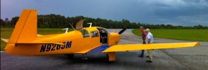
and then as a second a bright yellow ala piper cub or the SNJ trainers of old....
I know it depends on the background, etc... desert is different from forest, ocean, etc.....
But I'm asking generally...all things considered....most universally versatile...the most visible.
What is generally considered to be the easiest color/scheme for others to see?
I'm thinking vfr see and avoid
and I'm also thinking search and rescue in the event of an off-airport landing or crash
My mind keeps coming around to the red/orange and white schemes used in military training aircraft and USCG aircraft. Surely there's been some science applied to that decision....
and then as a second a bright yellow ala piper cub or the SNJ trainers of old....
I know it depends on the background, etc... desert is different from forest, ocean, etc.....
But I'm asking generally...all things considered....most universally versatile...the most visible.


")