New paint scheme - opinions

Which positioning of the flag stripe relative to the red belly do you prefer?

  • Option 1

    Votes: 9 34.6%
  • Option 2

    Votes: 17 65.4%

  • Total voters
    26

Katamarino

Pattern Altitude
Joined
Dec 14, 2011
Messages
2,099
Location
YPJT
Display Name

Display name:
Katamarino
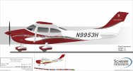
The 182 goes to paint in July and I've just about finished working on the new paint design; with Scheme Designers doing the actual graphic design to turn my ideas into graphics.

I wanted an evolution of the current design, so I am using the same colours, and the same "wavy" flow (instead of going for a jagged design).

I have it down to two very slight design variations that I'm undecided between. I'd be interested in what the assembled gang think. The only difference I'm still looking at is the exact position of the "flag" stripe, relative to the red belly. Close together, or with greater separation?

The tail and registration will be as in option 2.

Option 1:
UJyqx61.jpeg


Option 2:
nER6dpr.jpeg
 
The lower wing looks too small on the first one, and too large on the second.
 
I like the second one better.
 
Tail on the second, forward of the tail on the first. My opinion, that and $6 will get you a coffee these days.
 
Indeed, that was the main reason for the change. Hard to get a decal over the latch and have it look good.

One question, how do the decals stand up over time? I would consider losing the flags decals and make it paint (solid color like first section on the cowl).
 
One question, how do the decals stand up over time? I would consider losing the flags decals and make it paint (solid color like first section on the cowl).
I have 20+ year old vinyl trim on my RV-6 that still looks like new. The aircraft is hangared when not in use.
 
One question, how do the decals stand up over time? I would consider losing the flags decals and make it paint (solid color like first section on the cowl).

I want decals for the flags as I intend to be adding plenty of flags over the coming years. If it does fade, I can replace them.
 
Take the Skylane and Cessna logo and put it on option one.
:yeahthat:
I would keep the stripes off the latch
:yeahthat:


Side note, I'm not a fan of red on horizontal surfaces (top of cowl). Sometimes fades at a different rate than vertical surfaces. I suppose that can be mitigated somewhat by taking good care of the paint.
 
I like them both. I probably wouldn't notice if I saw one and the other were switched out for it.

That said, I like the Skylane logo, and I like the drop shadow numbers. Also agree about not putting the decals over the latches. If for no other reason than it's a little distracting.
 
I'm with Chris in post #2.
I like them both, so flip a coin

Question, what's with the flags? I can't see them well enough to see what flags they are...State flags I assume, so States visited? Ho sorry, I see you are UK, so probably countries visited..... nice!
 
The 182 goes to paint in July and I've just about finished working on the new paint design;
Just curious, which paint shop are you using? Keeping it Texas local or traveling a bit? Long lead time to schedule?

One of these days I’ll need a strip/respray on my RV-8, so I’m always curious about potential TX paint shops. But then again, there’s always Mena…
 
Just curious, which paint shop are you using? Keeping it Texas local or traveling a bit? Long lead time to schedule?

One of these days I’ll need a strip/respray on my RV-8, so I’m always curious about potential TX paint shops. But then again, there’s always Mena…

I'm going with Murmer at KAXH. Not the cheapest but very well recommended, and easy to visit through the process.

I settled on pretty much the final design:

1O-1.jpg
 
As a Textron stock holder I vote for option #2 since you are giving us free advertisement. I also own Garmin if you want to advertise that too.
 
I like 2 only cuz the stripe has more space in between and you see it better. But I like the numbers of 1 better
 
I'm with Chris in post #2.
I like them both, so flip a coin

Question, what's with the flags? I can't see them well enough to see what flags they are...State flags I assume, so States visited? Ho sorry, I see you are UK, so probably countries visited..... nice!

 
The 182 goes to paint in July and I've just about finished working on the new paint design; with Scheme Designers doing the actual graphic design to turn my ideas into graphics.

I wanted an evolution of the current design, so I am using the same colours, and the same "wavy" flow (instead of going for a jagged design).

I have it down to two very slight design variations that I'm undecided between. I'd be interested in what the assembled gang think. The only difference I'm still looking at is the exact position of the "flag" stripe, relative to the red belly. Close together, or with greater separation?

The tail and registration will be as in option 2.

Option 1:
UJyqx61.jpeg


Option 2:
nER6dpr.jpeg
Do it one way on one side and the other way on the other side.
 
I keep going back and forth, but I think #2 makes the flags more of a feature.
 
I'm going with Murmer at KAXH. Not the cheapest but very well recommended, and easy to visit through the process.

I settled on pretty much the final design:

View attachment 128022
I like that one better also. But I would leave off the Cessna and Skylane logos unless being paid to have them there. I'm strongly anti-badging and find it super annoying that every vendor seems to think it's their right to advertise in my home, on my vehicles, etc.

Just from where I'm sitting at the moment, I see gigabyte, apple, canon, JBL and sony branding despite my efforts to remove as many of these intrusions from my life as is reasonable.

However, since I don't even have unanimity on this with the people I live with, I don't suppose many here will care much either. :D
 
Like great. It would be fun to have a perfect shiny paint job.
 
You're a little far from me to do a photo shoot! Sure is pretty!
 
Dang… I’d like to get a plane painted someday, but it’s the one upgrade that feels easy to out off. In a dry climate it is purely aesthetics.

When you were toying around with this, what was the easiest way to try out different designs in your head short of engaging the professionals? I have been kicking around some ideas but if there was an easy way to visualize it, it would help!

I looked for something similar to what I wanted, then worked with the paint shop who used photoshop to create a drawing of my scheme.
But mine wasn’t that unique, if you want something special I would learn how to use photoshop or something similar.
 
Back
Top